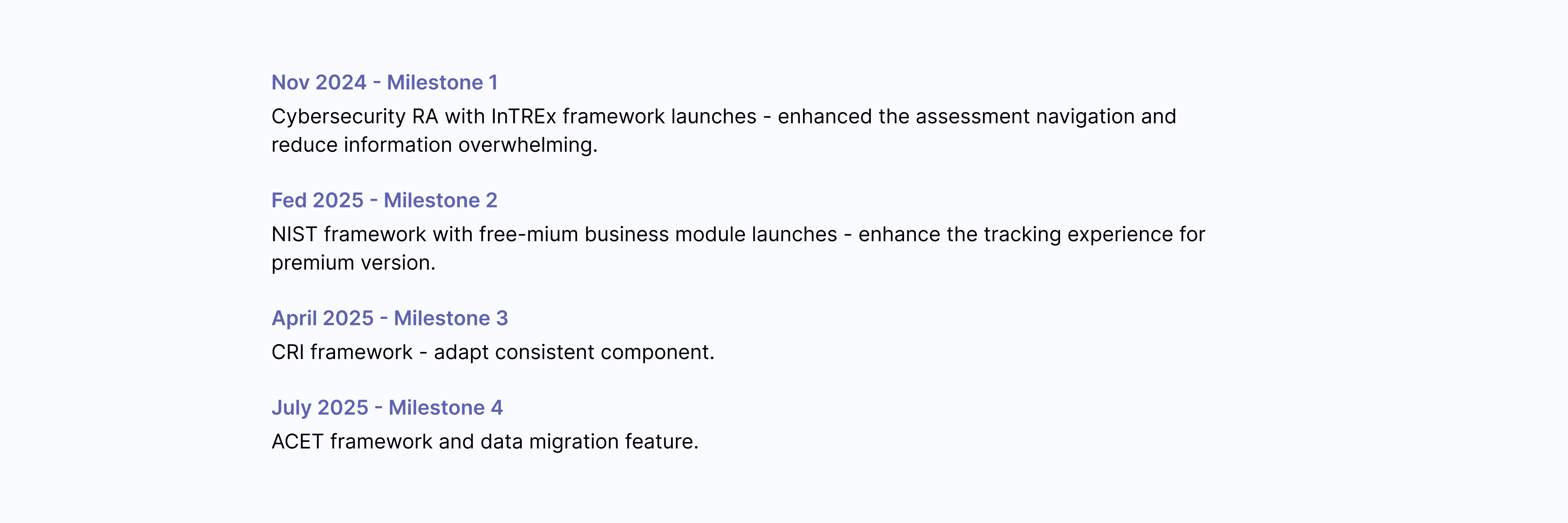
I revamped the Cybersecurity Assessment module by scaling it to multiple frameworks (NIST, CRI, FFIEC, ACET, InTREx), improving information architecture, and introducing a freemium model with premium features like insight visualization and lifecycle problem tracking—boosting adoption and driving an 11% freemium-to-paid conversion uplift.
Impact
95% task success rate.
17% increase of overall NPS score.
21.6% freemium-to-paid conversion uplift
Role
UI UX Designer - Interaction design, User flow, Information Architecture
Stakeholder
Developers, Project Owner, and Content and Security consultants.
Timeline
Sept 2024 to April 2024
Background
What is a cybersecurity assessment?
A cybersecurity assessment is a structured self-evaluation that organizations use to measure how secure they are. It asks questions about controls, processes, and preparedness, then scores the organization’s maturity.
For banks and credit unions, passing these assessments isn’t optional — regulators require them, and results influence trust with auditors, partners, and customers.
Context
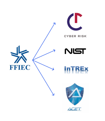
Regulatory Shift: FFIEC Sunset
In 2023, the FFIEC cybersecurity self-assessment — widely adopted by U.S. financial institutions — was claimed its sunset at 2024 august. This regulatory shift left thousands of organizations in urgent need of alternatives.
FFIEC Alternatives
Problem
Compliance managers found the assessment module hard to use, unclear to interpret, and lacking guidance on alternatives — leaving them unprepared for FFIEC’s retirement.
Goal
Provide a scalable multi-framework solution
Support 5 frameworks (NIST, CRI, ACET, InTREx, as FFIEC replacement) in one consistent, user-friendly module design that could grow with future regulatory changes.
Introduce a freemium growth strategy
Lower adoption barriers with a free tier while implementing premium, high-value features that users are willing to pay for — driving both retention of current customers and acquisition of new ones.
Solution-scalable
Scalable Assessment Management
Restructured the system to support multiple assessment types (like NIST CSF, InTREx, CRI), making it easy for users to start, resume, and manage all assessments in one place—without confusion.
Solution-scalable
Clearer and scalable Question page
Redesigned the question experience to reduce overwhelm, adaptive to multiple framework, and delivers future-proof value.
Solution-freemium growth
Clearer Insight and Interpretation
Implement risk mitigation standard and a variety of data visualization diagram so user can easily gain perspective into their assessment results by comparing their goals and spot key gaps.
Solution-freemium growth
Full-life cycle problem tracking
Designed a post-assessment problem-tracking module that keeps remediation in the same platform all year, then seamlessly rolls progress into the next year’s assessment—driving follow-through, loyalty, and retention.
Discovery
Discovery
Understanding User
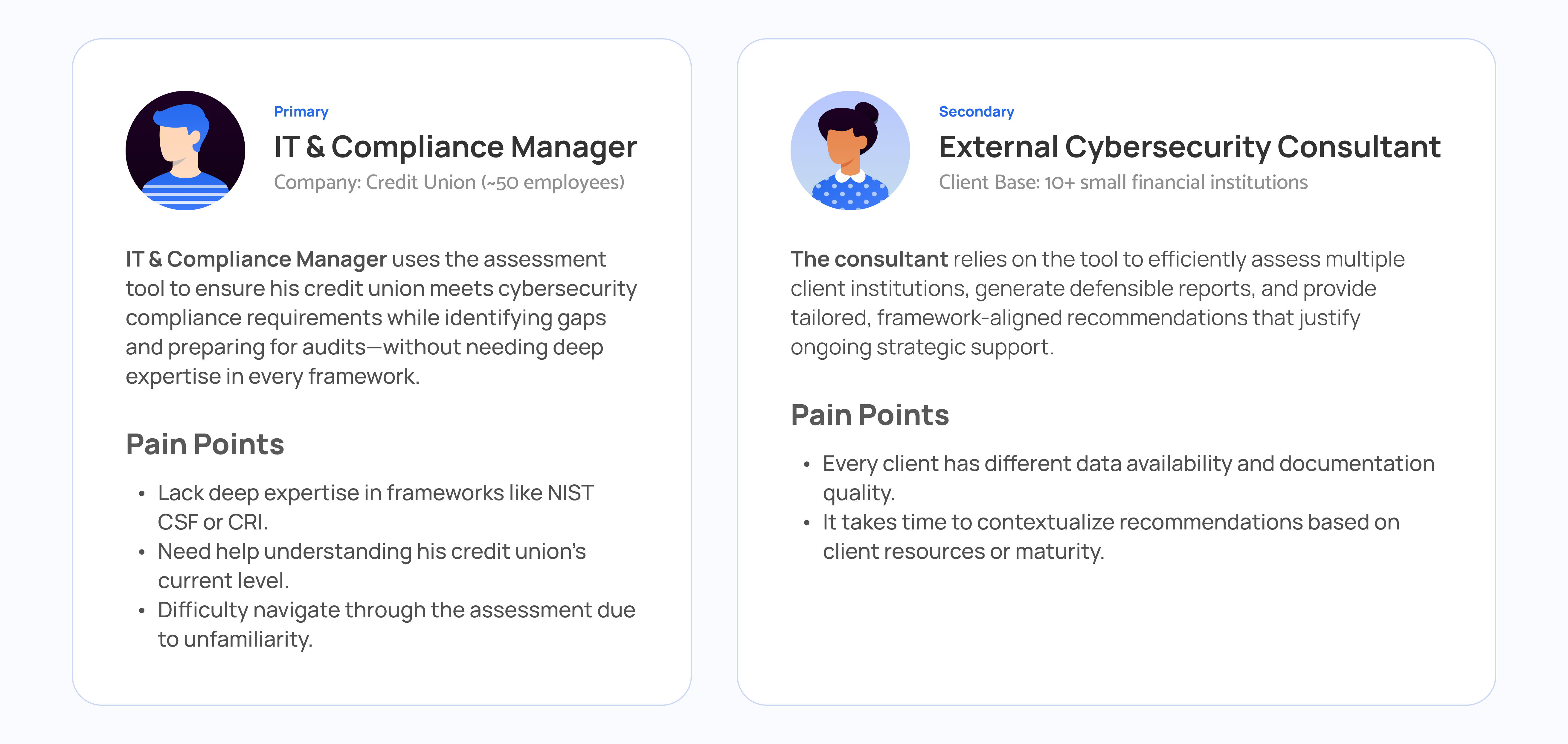
During early discussions with our internal cybersecurity expert and interviews, I identified two main user types who used the old FFIEC tool. Through the interviews, one key insight was that IT managers, who represent about 90% of the user base, struggled significantly with the tool due to limited cybersecurity expertise and unfamiliarity with the tool's flow. Given their prominence and needs, I prioritized this primary user group and conducted usability testing to further explore their confusion.
Discovery
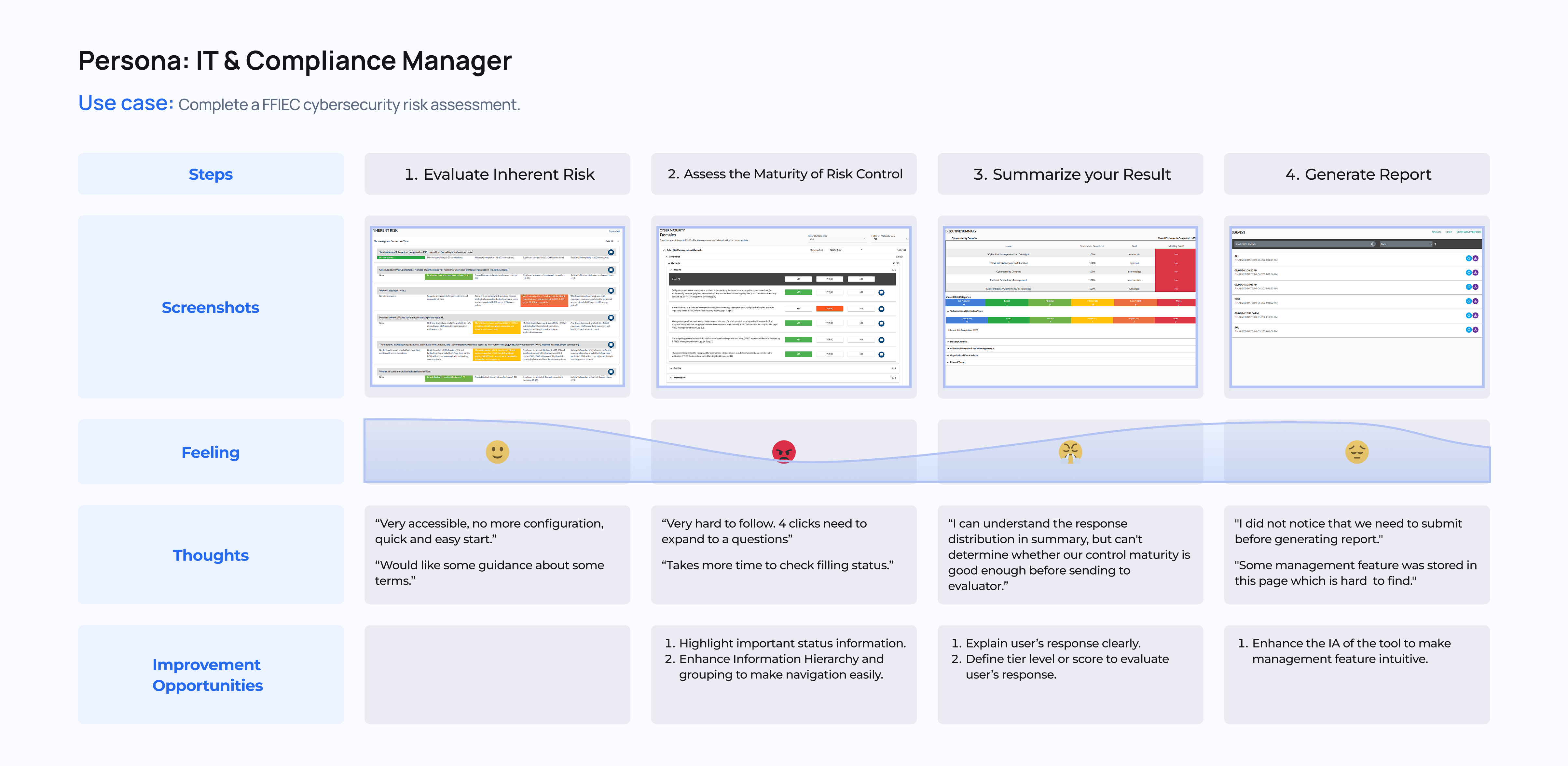
User Journey
Through initial usability testing and analysis of support tickets from the customer service team, I took the opportunity to self-learn the tasks and main user flow of our legacy FFIEC Cybersecurity Risk Assessment tool. I also gathered insights into our primary users’ feelings and the obstacles they faced while completing an assessment. From this process, I identified three key opportunities for improvement to enhance the user experience in the redesigned module.
Challenge 1- multi-framework management
How might we help users quickly access and manage previous assessment and multi-framework assessments?
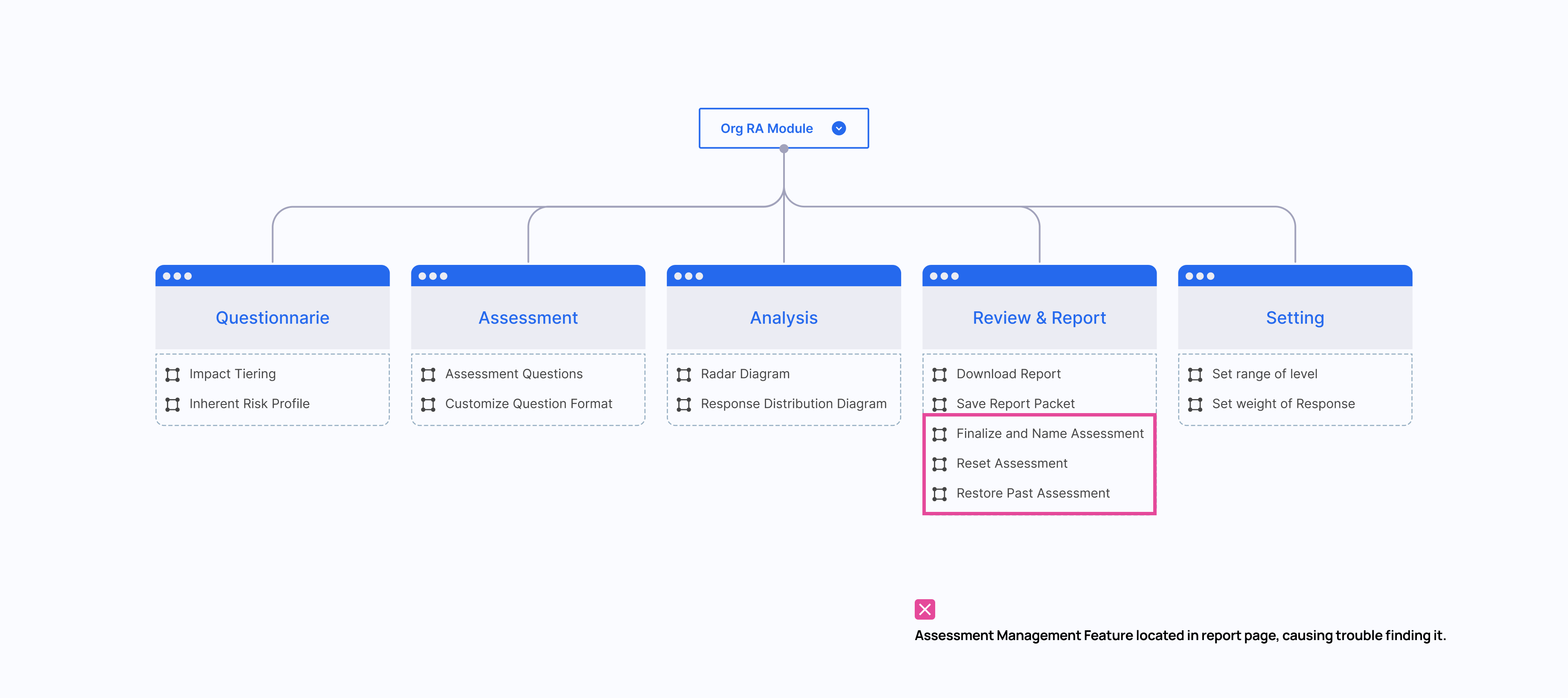
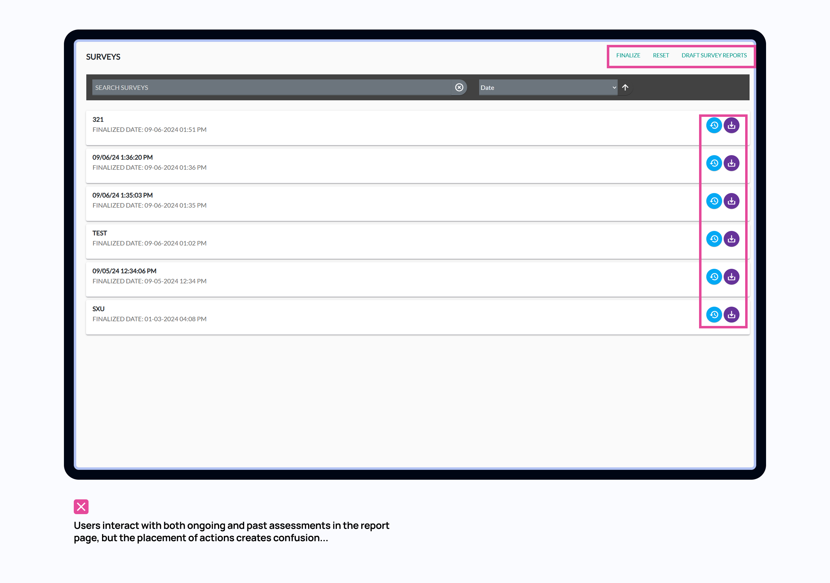
The old FFIEC tool is in a flat structure: fill out an assessment, view the summary, and download a report. In Report page, there is also assessment management feature. It lets users see previous assessments, finalize drafts, or download reports. But here’s the problem — it’s hidden as the last tab, as if it’s the ‘final step’ of an assessment. This works okay for first-time users who just finished an assessment — they naturally land there. But for returning users, or anyone managing in-progress assessments, it’s really unintuitive. They have to click through the full flow just to reach that page — even if all they want is to download a past report or resume a draft.”
Problem
Scattered Report Page
Users interact with both ongoing and past assessments, but the placement of actions creates confusion...
🧑💼Here’s feedback from usability testing:
"I’m not sure which button to click to get a report for the assessment I just completed. ‘Finalize’? ‘Draft Report’? The buttons don’t guide me through a clear flow."
"I rarely use the ‘Finalize’ feature and don’t really understand what it does."
"If I click ‘Redo’ in Impact Tiering, will it reset my entire assessment? It’s not clear."
Solution
Centralized Management Page
Clear layout aligned with users’ mental models
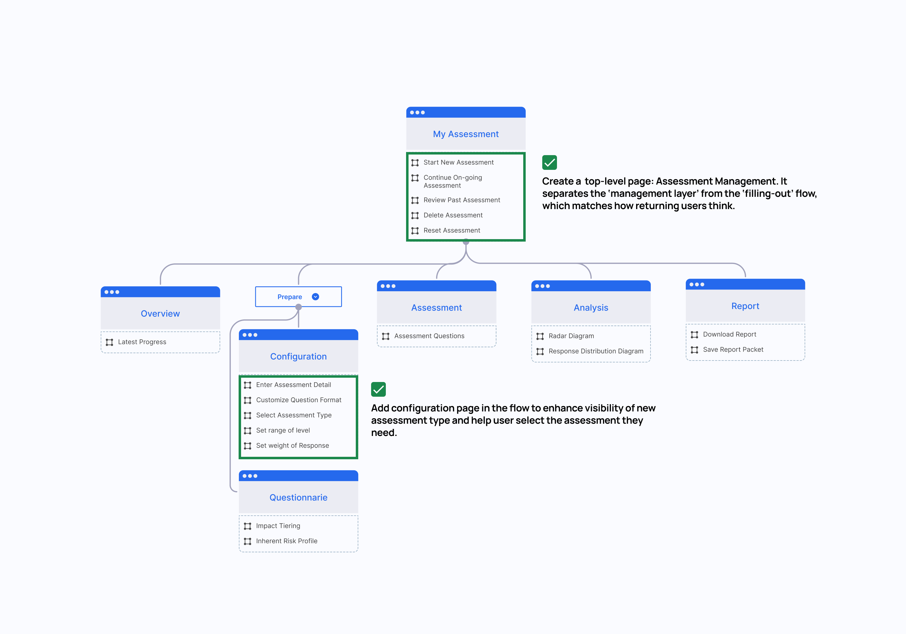
Instead of keeping Review & Report as the last step in the flow, I’m turning it into a top-level page: Assessment Management. It separates the ‘management layer’ from the ‘filling-out’ flow, which matches how returning users think.
Solution
Centralized Management Page
Content-oriented actions
Prioritized frequently-used action based on assessments’ status, which helped reduce friction and made decisions more intuitive.”
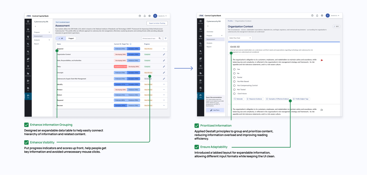
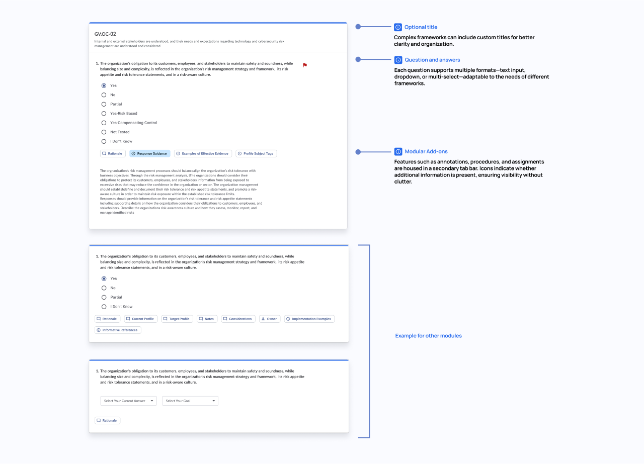
Challenge2 - Question Hierachy
How might we create an adaptive questionnaire that minimizes user effort while making status and hierarchy clear and intuitive?
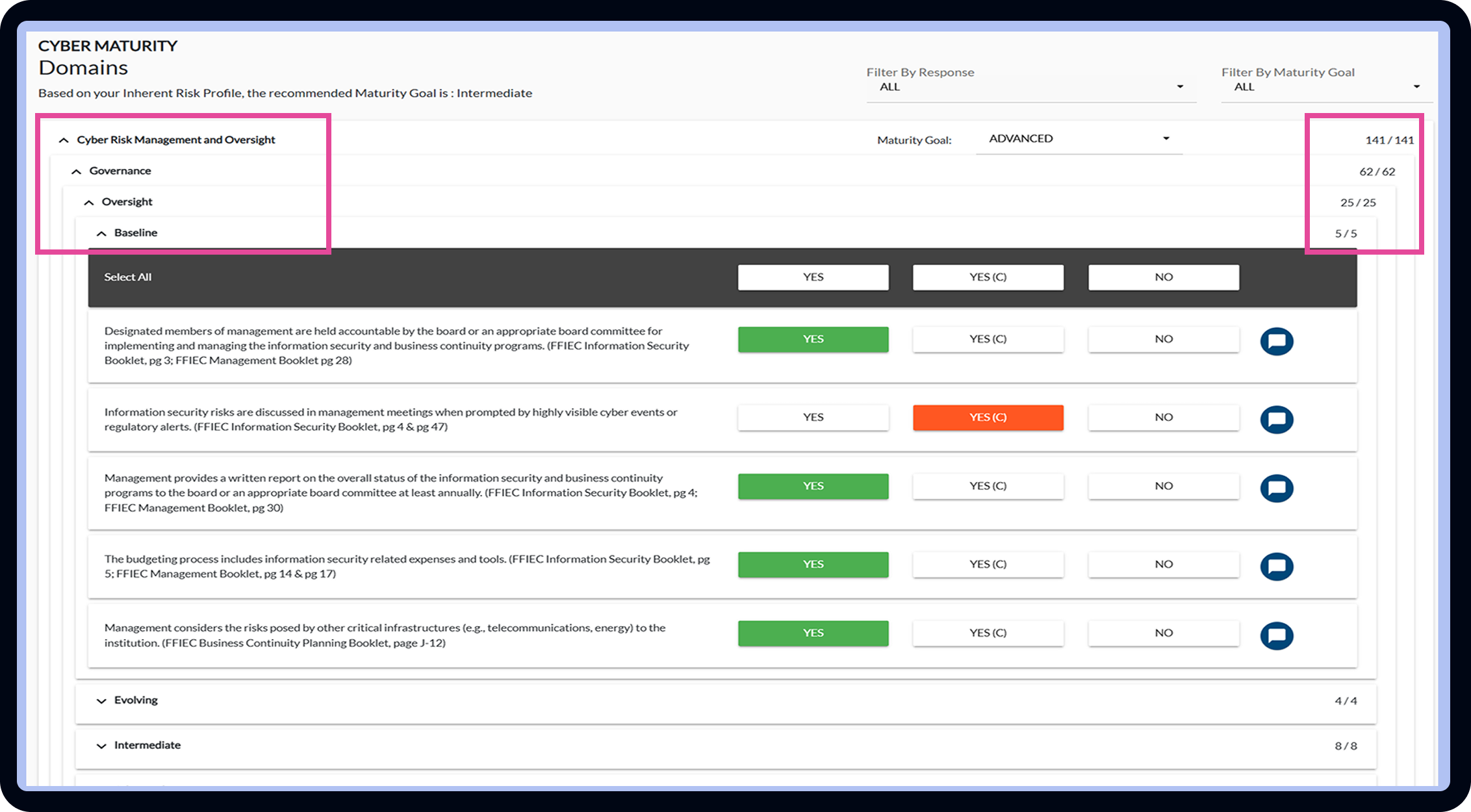
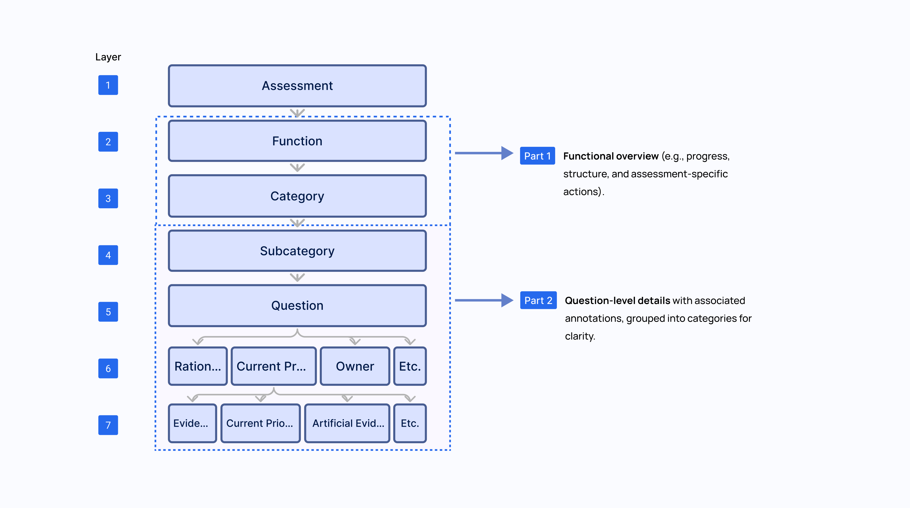
To design an effective solution, I analyzed the official assessment sheets across five distinct types (e.g., NIST, CRI, ACET, InTREx) and identified Information Architecture inside an assessment and categorize them into two parts in design brainstorming.
After
Clearer and scalable Question page
I separated the complex hierarchy into two pages: the parent page maintains a universal appearance across frameworks to improve visibility, while the child-category page adopts an adaptive design to provide a seamless and undisruptive survey experience.
To meet the unique needs of five frameworks and prepare for future modularity, I designed and created an adaptive plug-and-go module that integrates annotations, procedures, and notes.
Moreover, this component delivers future-proof value:
New frameworks or rules can be added with zero disruption;
Scales seamlessly with an evolving compliance landscape;
Reduces engineering overhead while supporting long-term product agility.
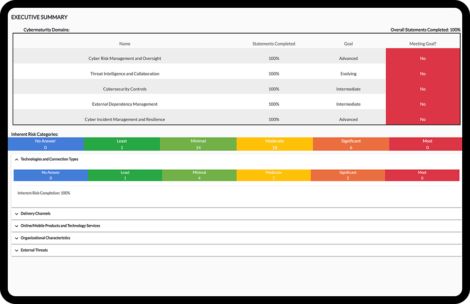
Challenge 3 - Result Interpretation
How might we help users clearly spot gaps and track progress toward goals base on assessment results
Before
The Assessment Result is hard to Interpret
🧑💼feedback from users
“I can understand the response distribution in summary, but can't determine whether our control maturity is good enough before sending to evaluator.”
Facilitating Expert Alignment
We need to create a standard that evaluate user’s performance, which requires security expert’s support. I facilitated a workshop using a framework and decision matrix to help experts align, evaluate ideas, and vote on a maturity model.
The content team then defined tier names, score ranges, and weights, while I translated the agreed structure into a user-friendly UI that made the model intuitive and actionable.
After
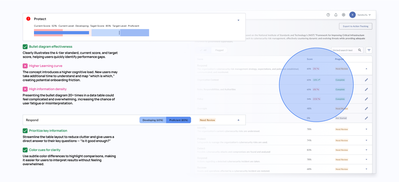
Find the Right Balance between Simple and Informative
I first created a bullet-diagram card in the assessment page that experts approved, but early testing revealed issues: new users took longer to understand the model and struggled to navigate, making the table harder to use. This make me rethink and separate my iterate design based on user scenario
Data Table : High-Level Overview
From the user’s feedback, the data table serves as a quick snapshot. Their priority here is to check whether each category is complete and to get a glance at their performance versus the target. Adding too much detail in this table would take up space, feel clunky, and overwhelm users.
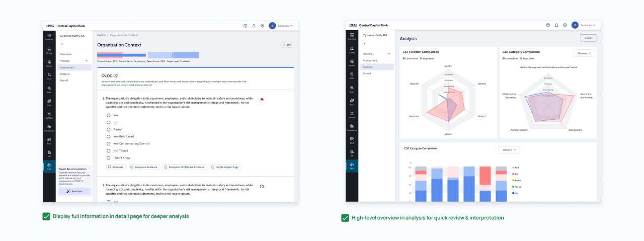
Category Pages – Deeper Exploration
Within each category page, users shift into review mode, focusing on detailed answers and questions. Here, we can provide richer diagrams, such as score differences and performance gaps, to help them understand exactly what went wrong and how much they need to improve.
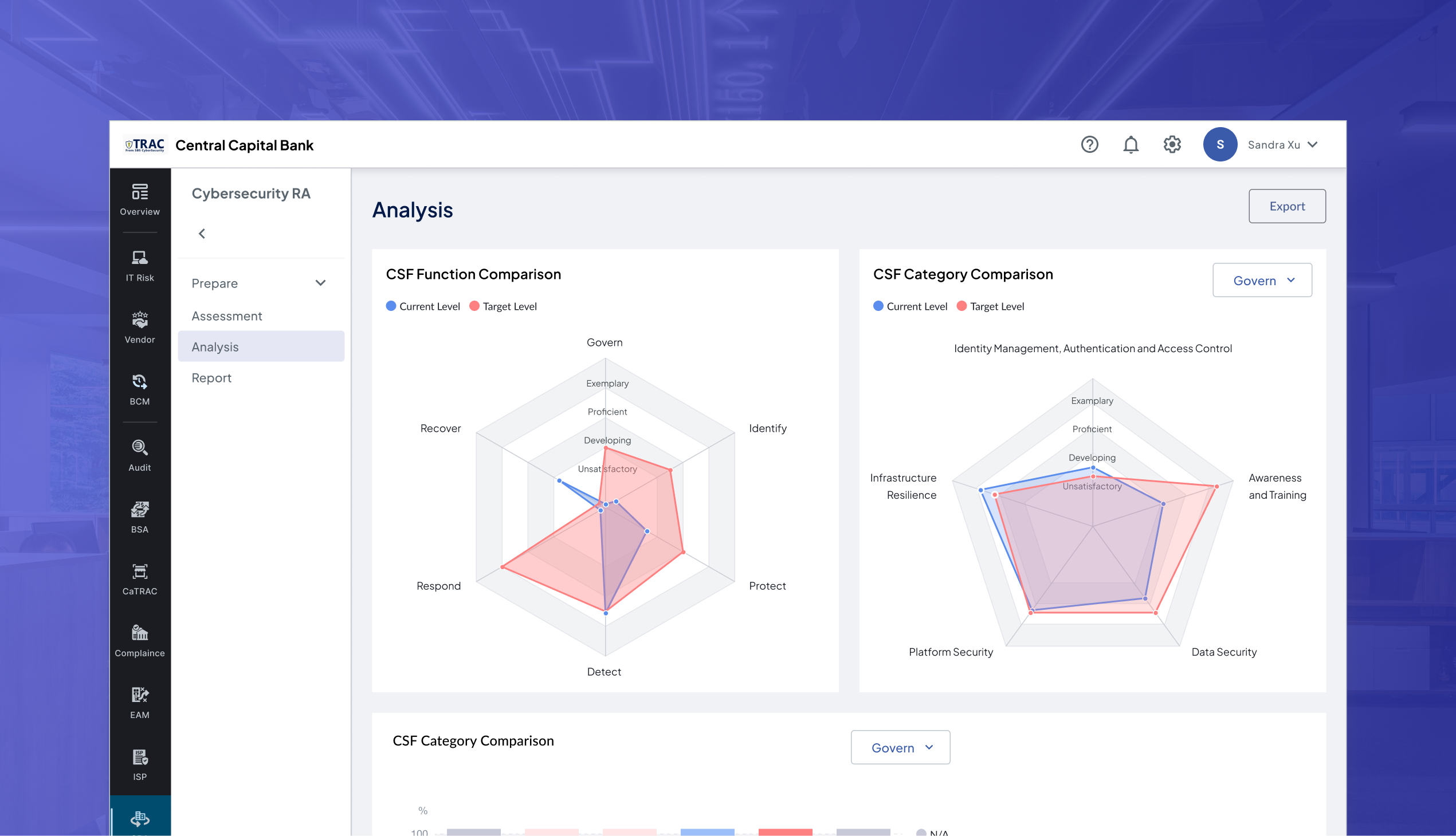
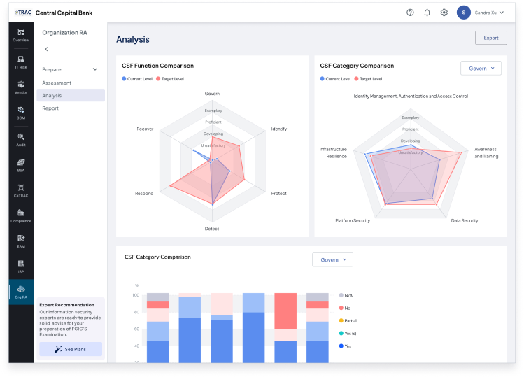
Post-Survey Review – Multi-Aspect Insights
After completing the survey, users want to reflect on the assessment as a whole. Beyond individual gaps, they need to compare performance across functions and categories to identify weak spots in the organization. To support this, I designed radar charts and distribution charts that allow easy comparison and highlight areas needing attention.
Challenge 4 - Full Cycle Service
How might we help users continuously track and improve their cybersecurity maturity through our module?
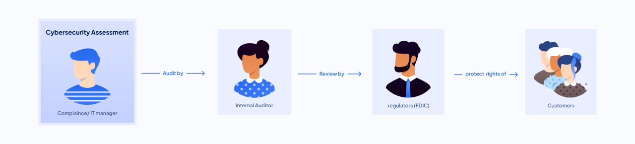
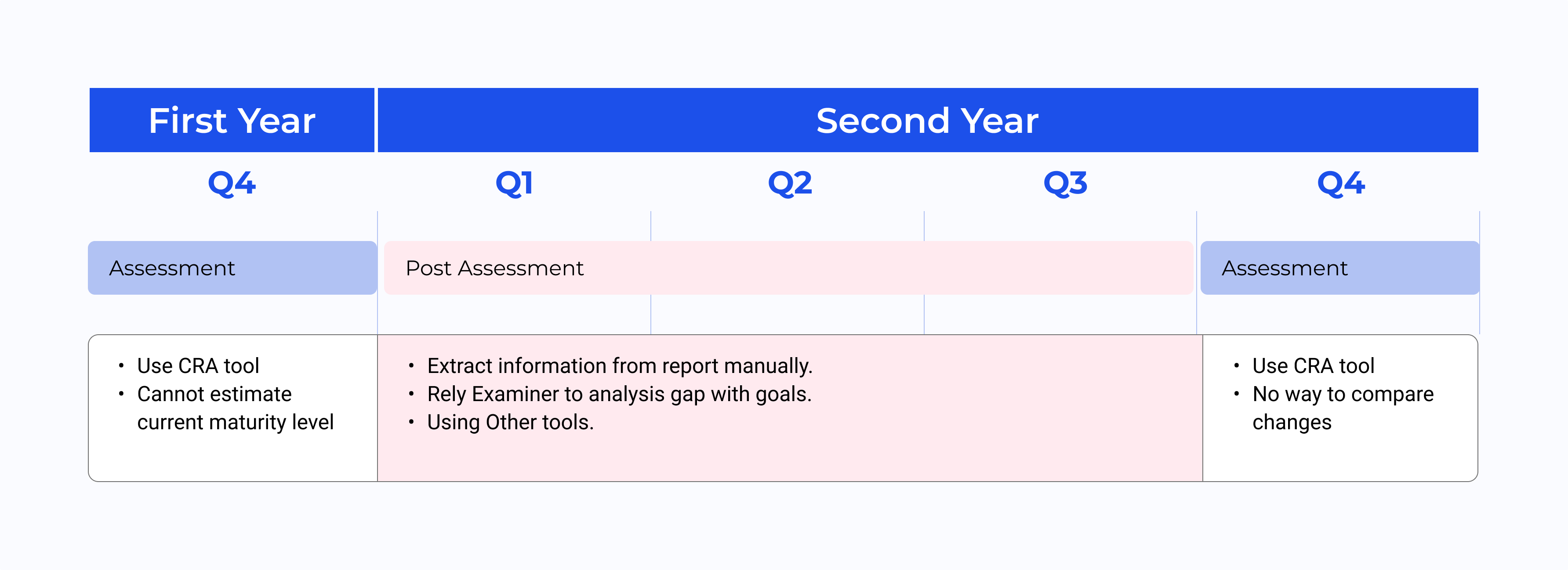
By reviewing support tickets and user interviews, we realized the old assessment ended too abruptly. After submitting the assessment, users are left on their own to manage risk control gaps using other tools. This breaks the experience, leads to frustration, and ultimately causes us to lose users. Below is a diagram showing the user's behavior during the annual cycle..
Through this, I saw an opportunity to increase premium adoption by designing features that extended beyond the assessment itself. I noticed a recurring issue: after submitting the report, users were left on their own. But cybersecurity maturity doesn’t improve with a one-time assessment—it takes months of tracking, actions, and review. So we reframed the problem as:
How might we help users track and improve their cybersecurity maturity overtime by making assessment feel continuous and actionable, rather than a one-off task?
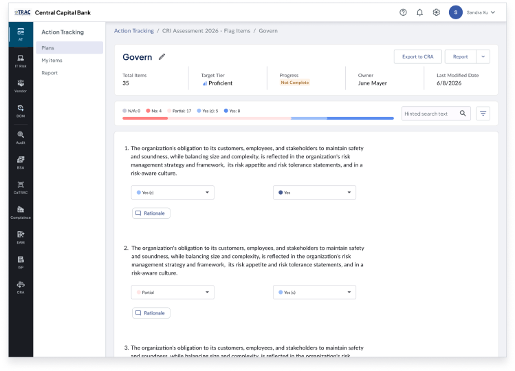
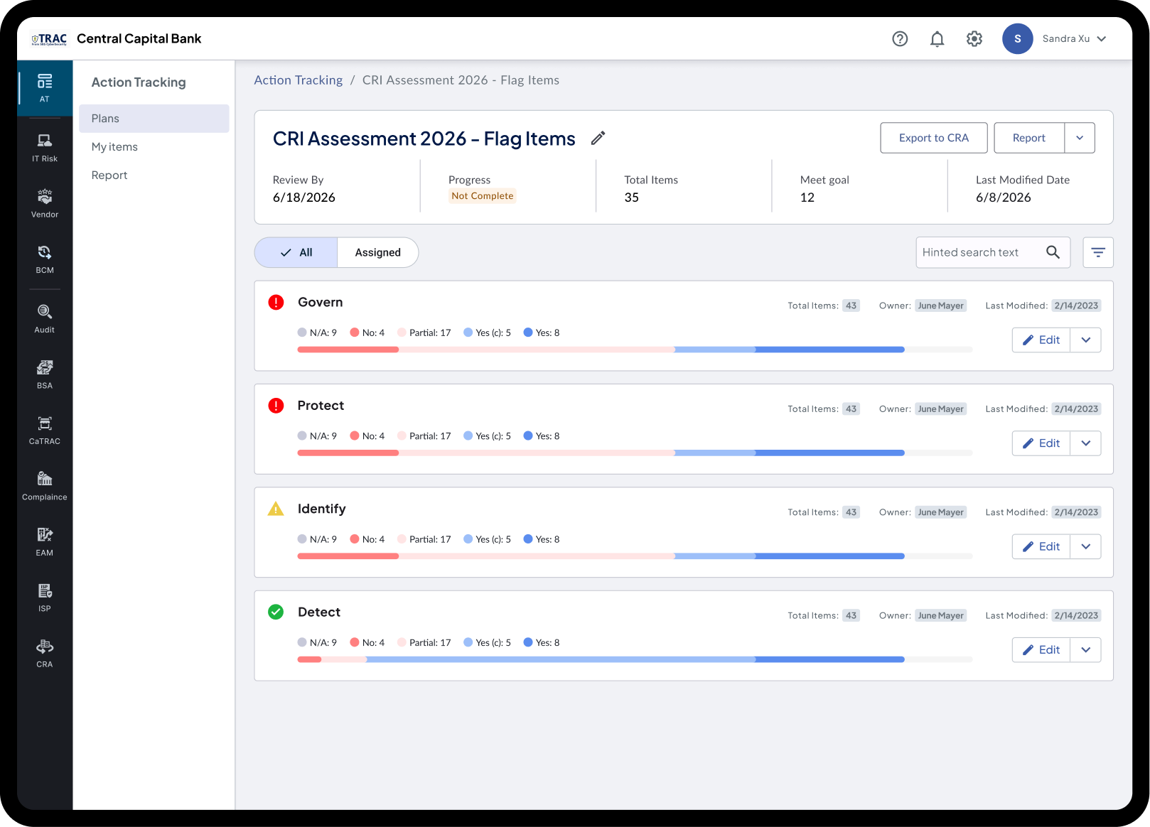
Post Assessment
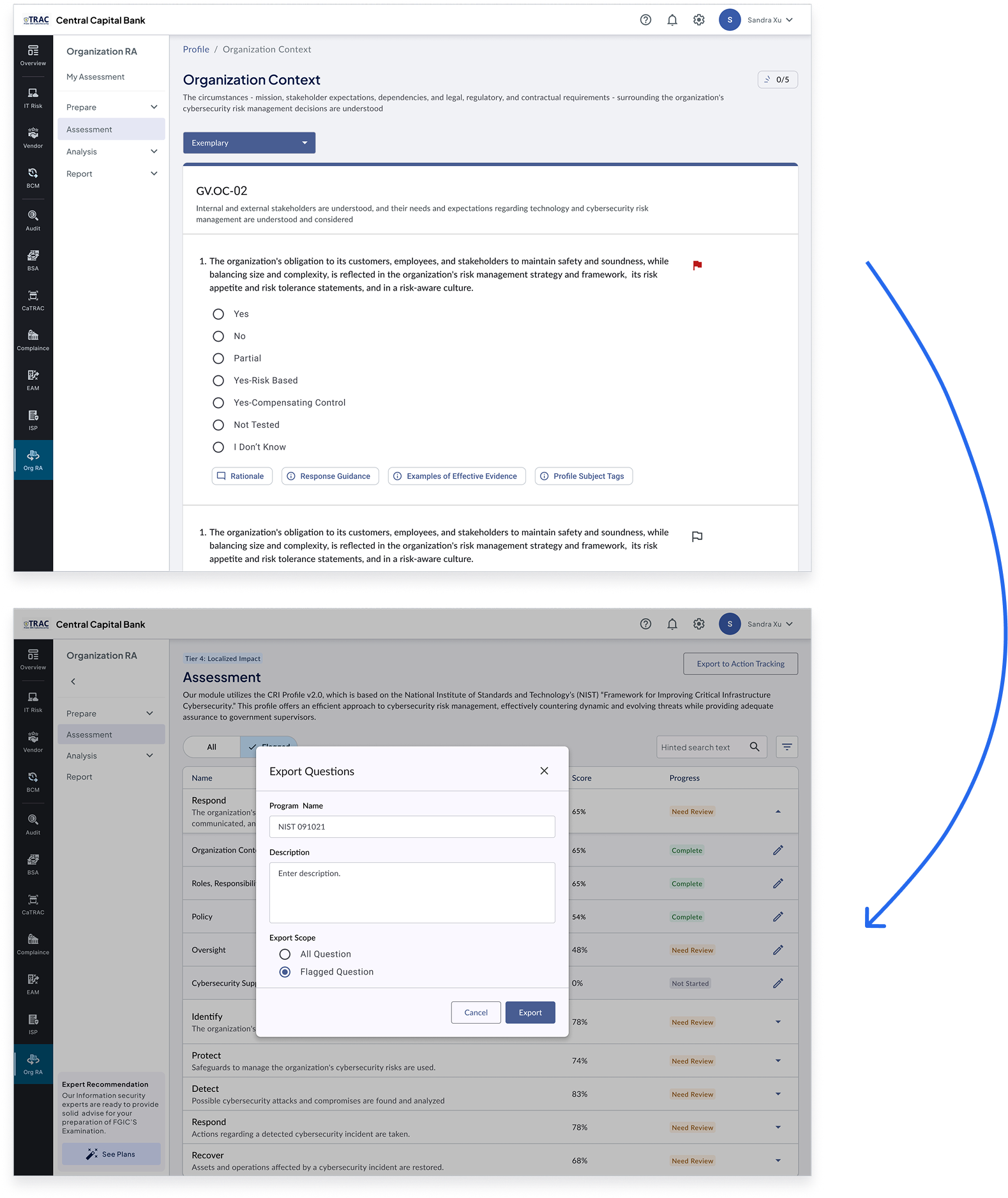
Flag and Post-assessment Tracking
Track unresolved issues seamlessly
Monitor progress on specific items before the next assessment cycle
Update Based on Previous Assessment
Continuous Action Tracker
Users can update based on previous assessments
Score changes and tier shifts are clearly highlighted